Wing Pang
Change
Brings New
Chances
2021
lettering
Overview
Change Brings New Chances is a series of three square hand-lettered posters inspired by Kris Andrew Smalls' typographic masterclass. The message "Change Brings New Chances" comes from my personal experience of moving form Hong Kong to Australia at a young age, and being at multiple schools during primary and secondary schooling. At university, my choice of changing degrees from Animation to Visual Communications also brought me new chances to further my skills in design and critical thinking. I like to think that while we may be fearful of uncertainty and change, it is a powerful way to bring forth new chances and opportunities that we otherwise would not have encountered.
Arranging text
Instead of using digital vectorised type like Smalls' masterclass, I decided to arrange text in a more handmade way through digital handlettering. In this process, I used the illustration app Procreate on my iPad with an Apple Pencil to draw out a combination of serif and sans-serif type. Each word is arranged within a square canvas in pure black to start with.
For these pieces, I paid close attention to traditional type conventions, such as our tendency to read from left-to-right, top-to-bottom for English text. I played with the scale of individual letters and form to make these posters more visually engaging.
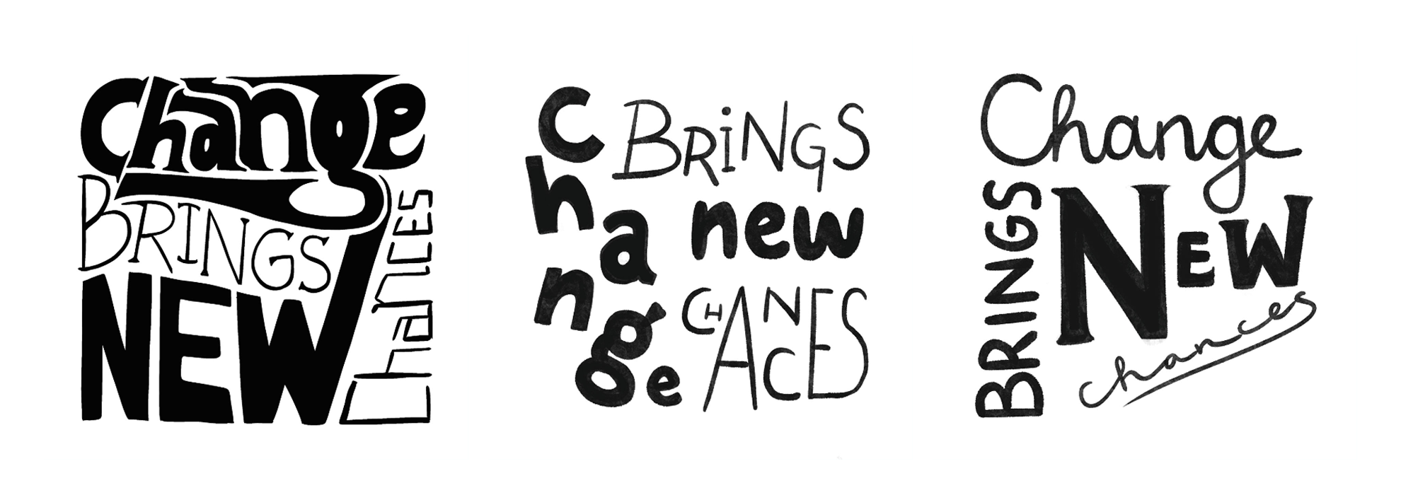
Black and white word layouts.
Creating texture
Step two of Smalls' workshop involved creating texture for the background. While he used tools such as the liquify tool on Photoshop, I wanted to go for a more subtle texture. In the end, I used a noise brush on Procreate to achieve a textured radial gradient for all three posters. These textures had a lighter center to emphasise the handlettered text.
In this step, I also started colouring the handlettered words to contrast the background colours.
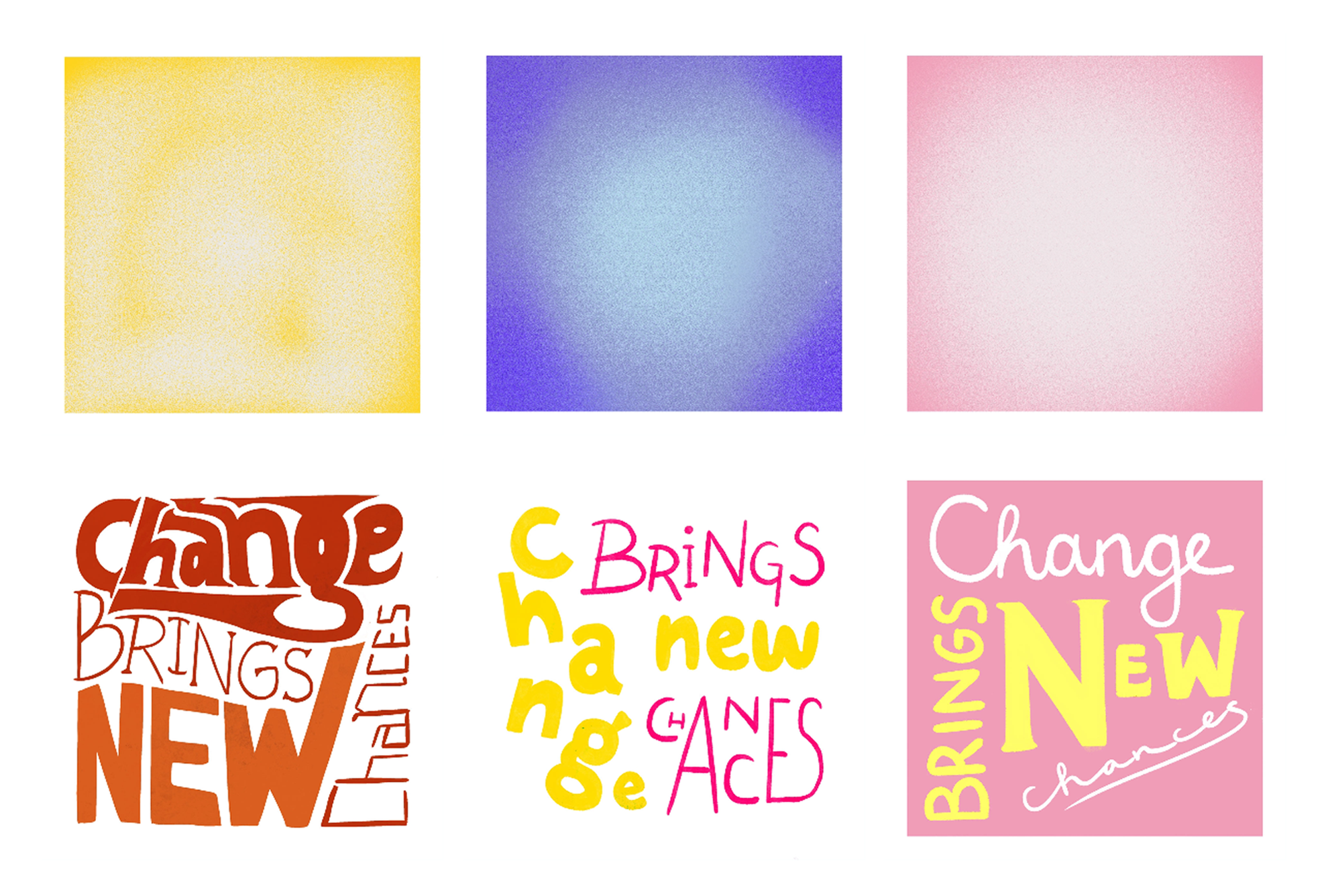
Noise backgrounds and coloured text.
Extra elements
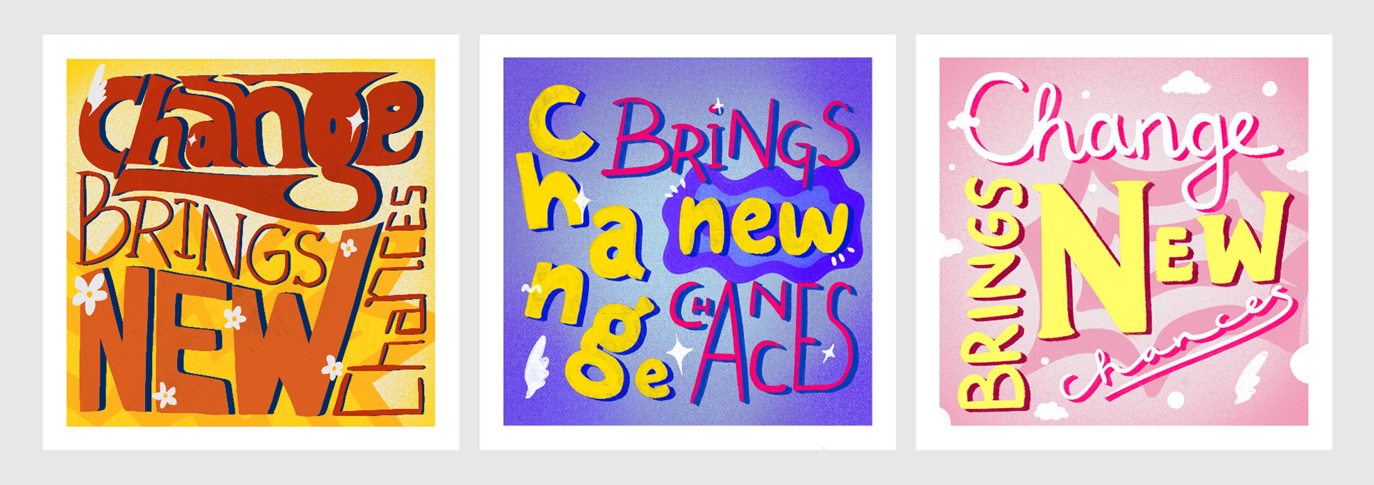
Decorative elements were hand drawn on layers both under and above the text layer to make the pieces more interesting. I found that overlaying doodles made each piece feel unique with personality.
These posters all had differently themed scribbles. The first poster had a floral theme, while the second poster had an ocean one. Meanwhile, the final poster's colours were inspired by a pink sunset.

Extra hand-drawn elements overlaid on the text.
Composing the
final posters
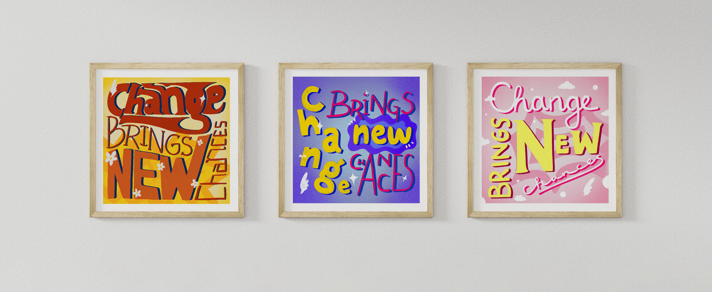
The four steps above were combined to create the final outcome - a series of three posters.
I'm very pleased with the end result, and enjoyed Kris Andrew Smalls' masterclass. I feel that oftentimes in design, we're constrained to the boundaries of grid and conventions which end up hindering our creative process. With Smalls' masterclass, the expressive and loose process made completing each poster an absolute joy.
Final poster designs.