Wing Pang
The Red
River County
2021
zine/3d
Overview
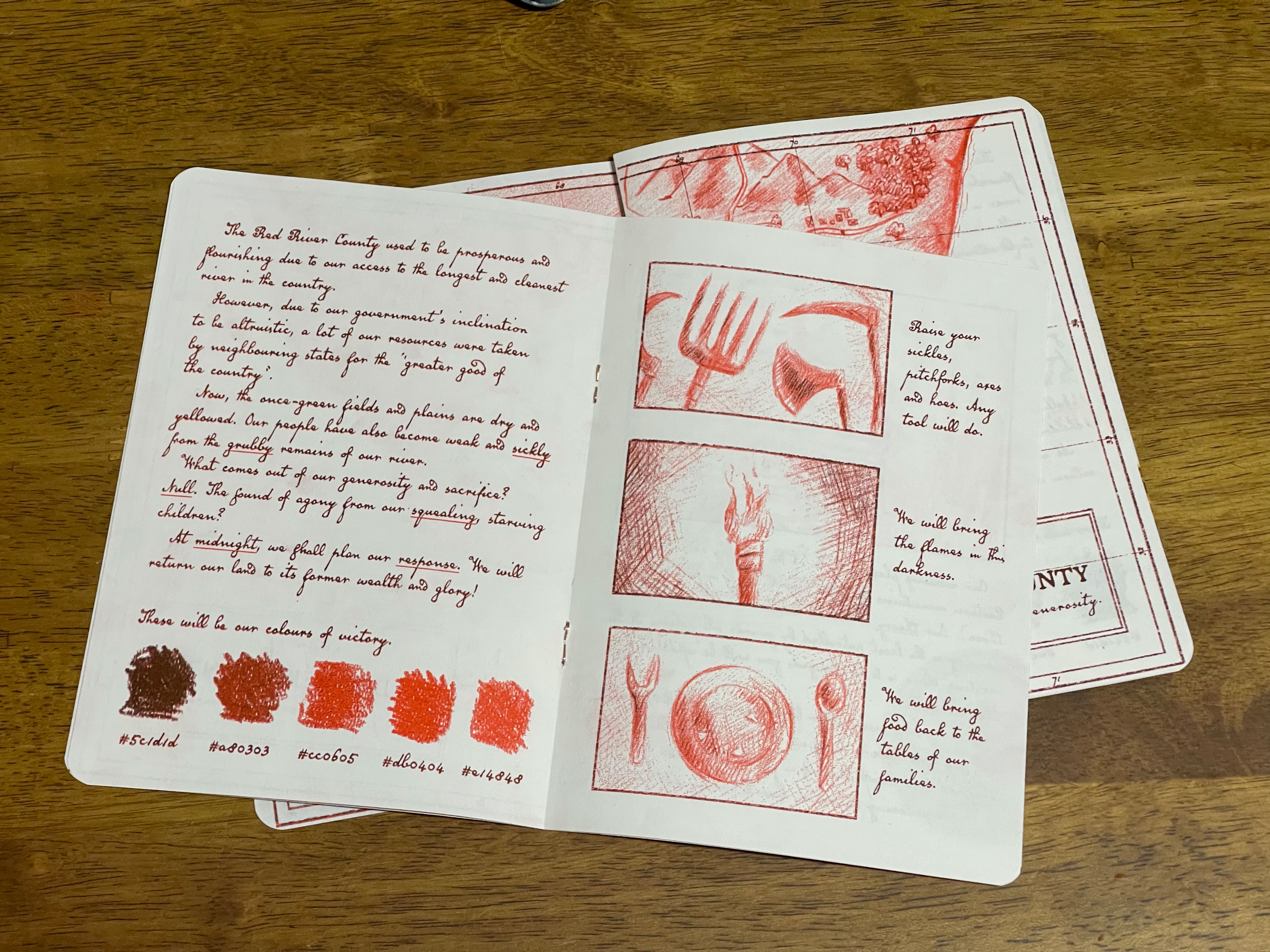
The zine of the fictional Red River County was created using randomised ideas generated through a random number generator. This project operated on the idea of chance and choice, where key words were generated by chance while the world-building decisions were made through my personal choice.
Ideation poster
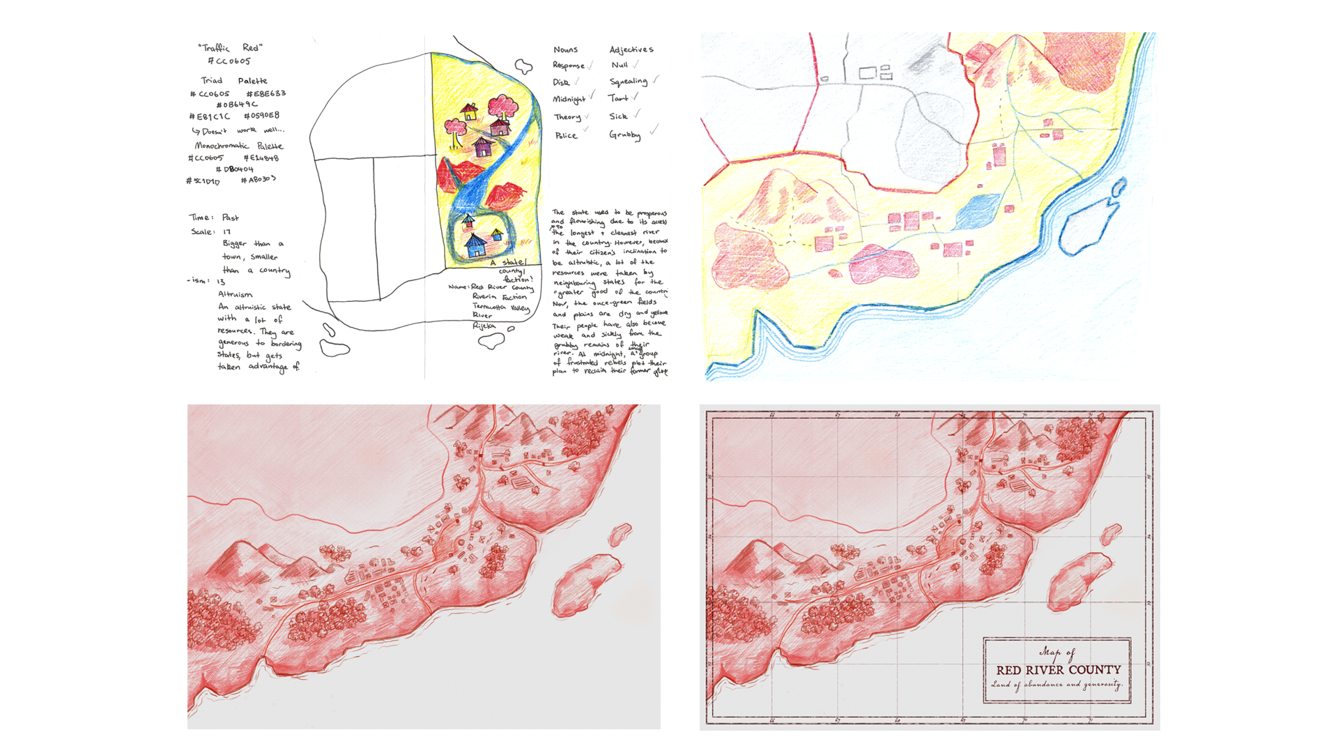
The poster (top left of the image below) that I started off with looked very different to the finished product aesthetically. However, the concept and narrative remained the same throughout the process.
The narrative of a rebellion due to an overly altruistic government came from the juxtaposition between the word ‘altruism’ and the negative connotations that are associated with the randomly generated nouns and adjectives. For example, some questions that prompted world building included:
- ‘Why are citizens of Red River Valley squealing, sick and grubby when their county is altruistic?’
- ‘What are the repurcussions of these people suffering due their government’s desire to be altruistic?’
Due to the limited space in this poster, the draft of Red River County was very rudimentary. It lacked the sophistication and detail that’s present in the final product.
Upon self-reflection, I thought that I should draw a map that adheres more to cartographic standards and create a map that’s realistic and convincing.
Iteration Process
In the beginning, I worked with a triadic colour palette with red, blue and yellow hues. How-ever, this colour scheme was difficult to work with and looked very juvenile in nature. I think this is due to its association with children’s playground sets.
Working with colour pencils was also very difficult due its permanent nature. Thus, my final piece was done digitally with a realistic pencil textured brush.
In the final versions of my work, I also changed the colours to a monochromatic palette (still based off the colour ‘traffic red’ that was randomly generated. This colour scheme fitted my world’s narrative much better and gave a more solemn tone.
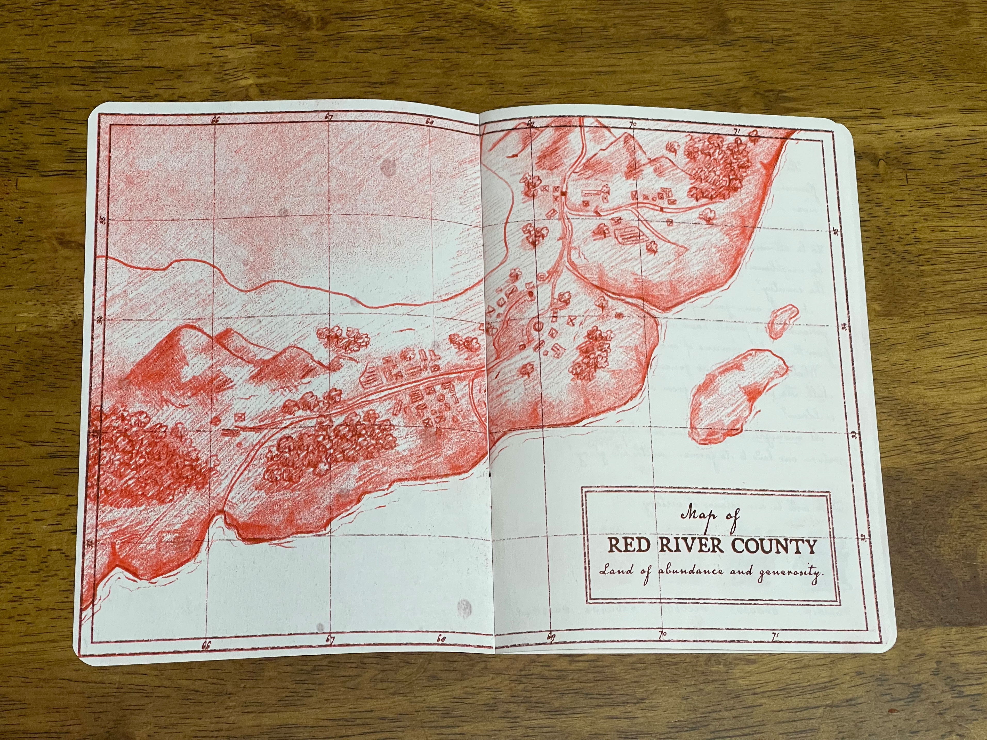
In order to make a map that’s believable, I used my geographic knowledge to construct a grid reference system that overlays the illustration. To give it an old-timey feel (due to its setting as ‘in the past’ from the random number generator, I used the typefaces Old Man Eloquent and Broadsheet. These typefaces are handwritten script and typewriter text respectively.
Additionally, grunge textures and discolouration was also applied digitally.
Progress illustrations for the map of Red River County.
Typesetting and
photo editing
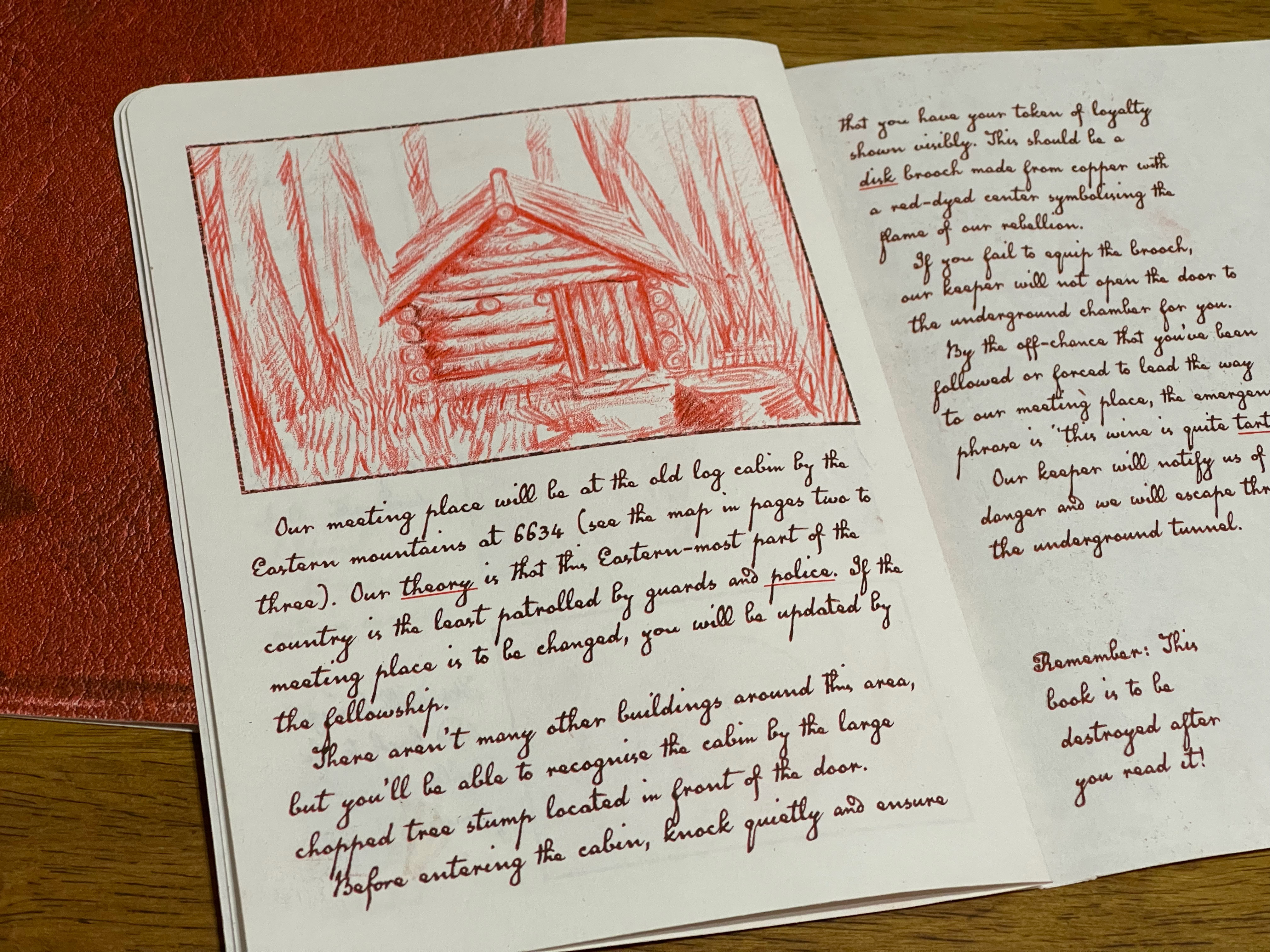
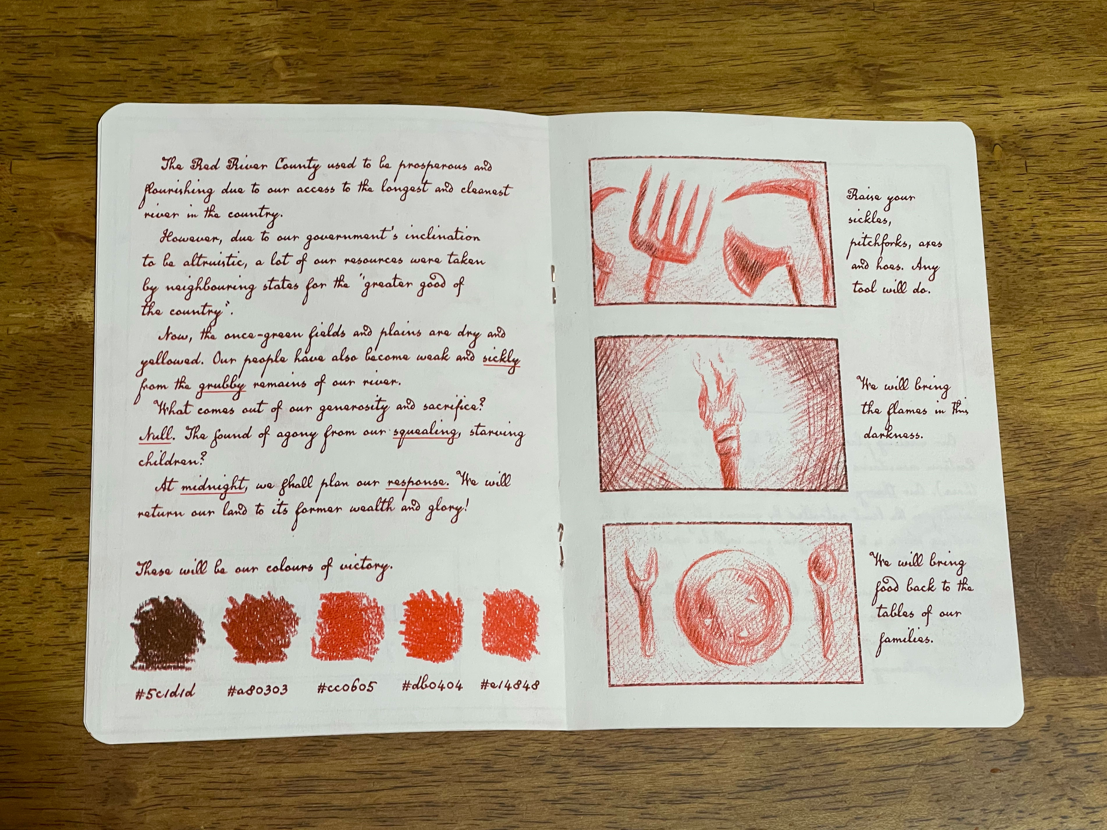
After drawing the map, I began writing and type-setting on InDesign while thinking of supporting images that I can illustrate. At this stage, I thought that a notebook from the perspective of a rebel would be interesting and suitable for the world. In my copywriting, I tried to integrate the words from the randomly generated word bank as naturally as possible.
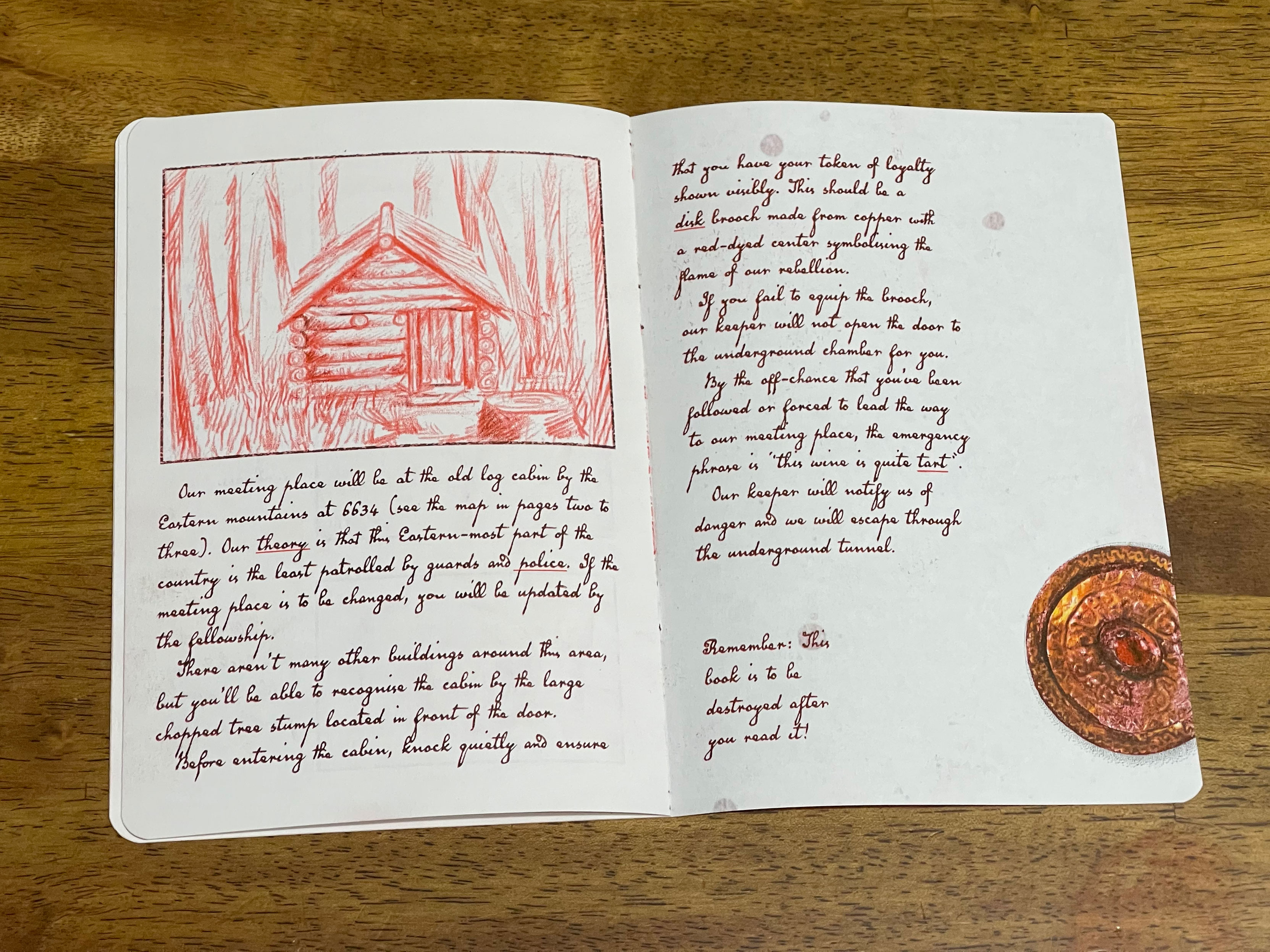
The word I had most difficulties with aligning to my narrative was ‘disk’. Upon further research, I found that an early form of jewellery includes disk brooches. So I’ve implemented it as a means of identification between the rebels. The image of the brooch that I’ve used in the zine was edited from a public domain image from the MET museum archives.
Finally, to replicate an authentic notebook, I edited a leather texture photo from the public domain photo library Pixabay to make it seem aged and used. This leather image is used for the cover of the book
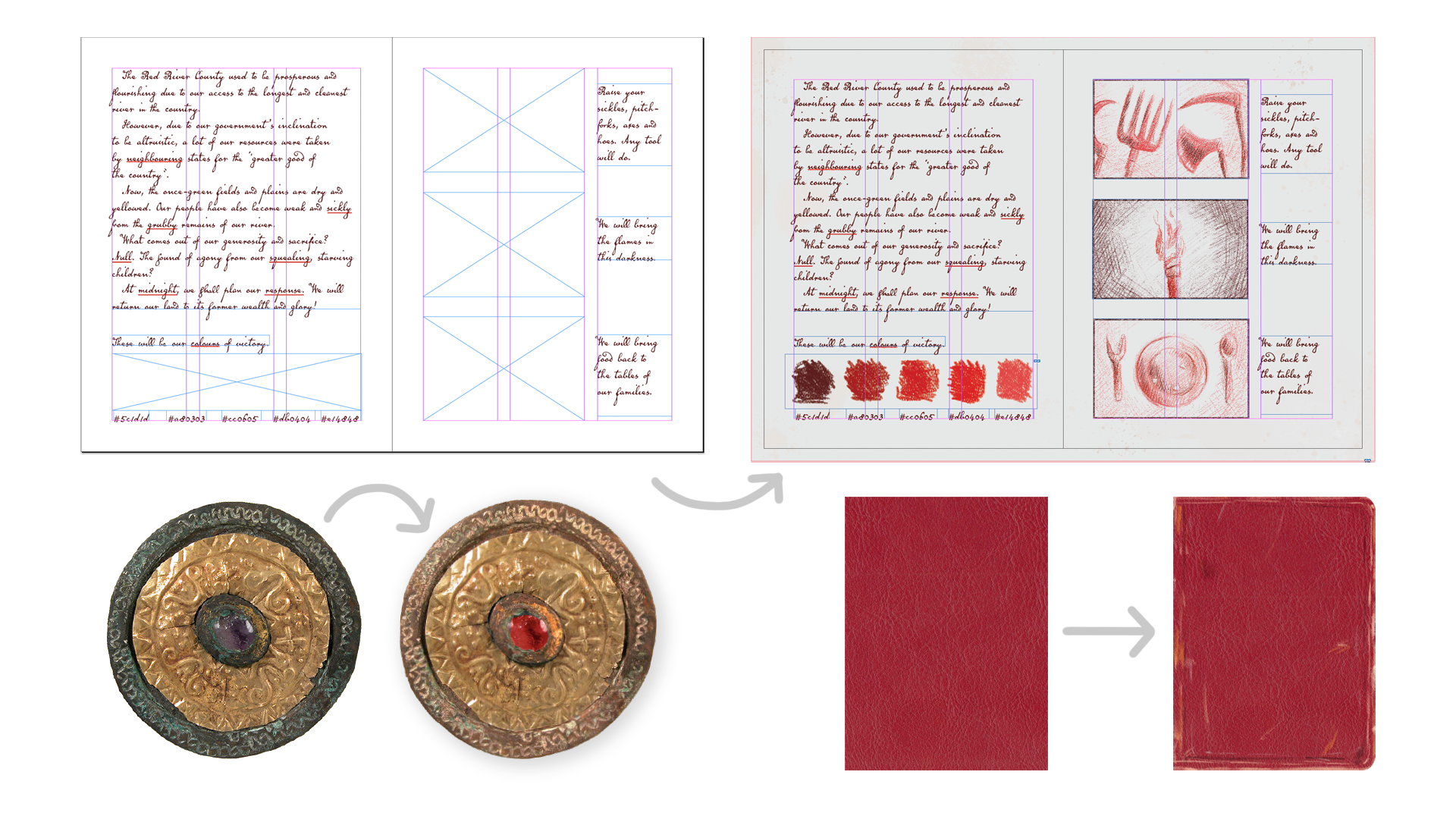
Screenshots of typesetting and photo edits.
Completed layouts
on mockups
The final layouts are completely on an A6-sized document with 8 pages including the front and back cover. The front and back cover are slightly bigger than A6 in order to fully cover the zine’s contents due to its rounded corners. This also helps to make the zine feel more like a miniature notebook. After showing the document to my tutor, she offered to help me with the Riso printing process to bring the zine to reality.
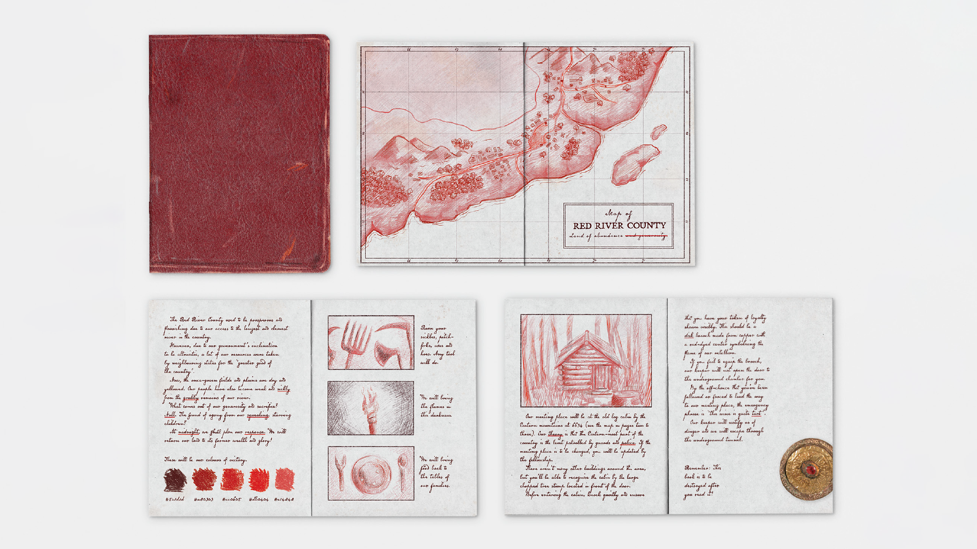
Zine layout on a digital mockup.
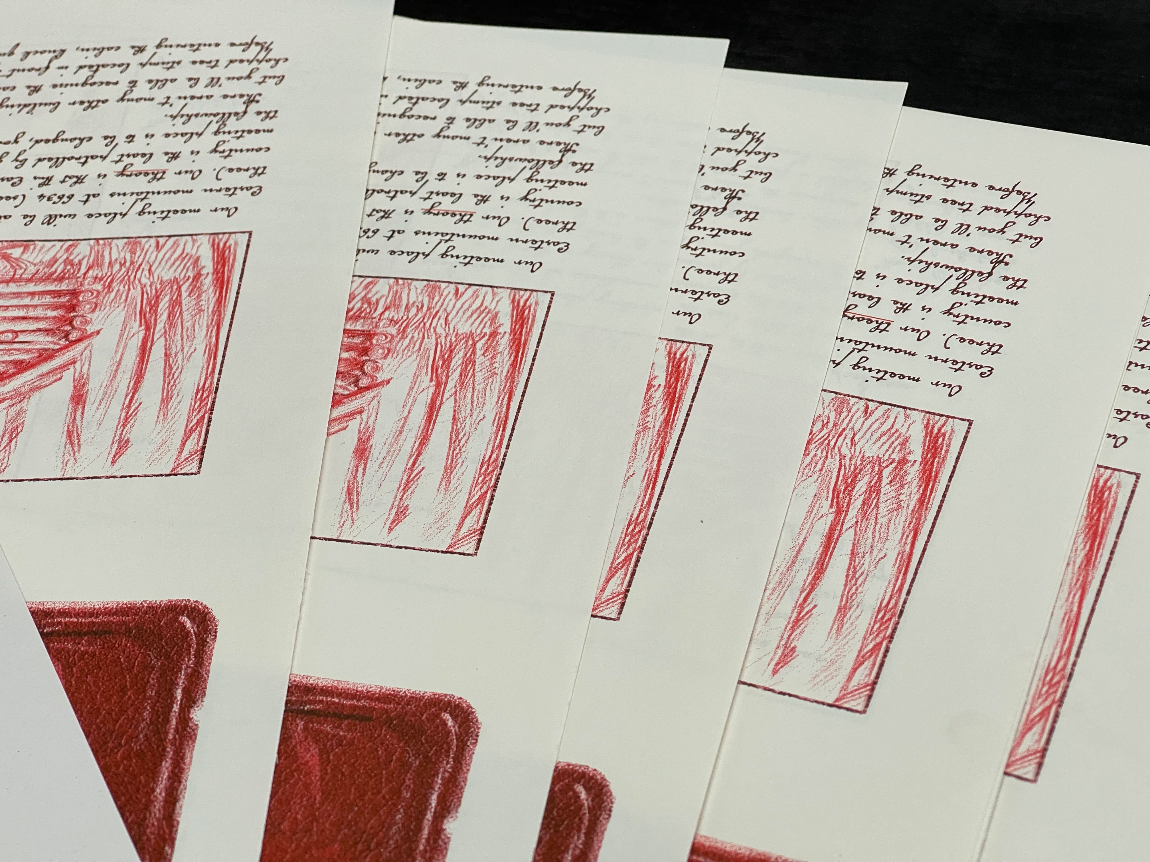
Riso printing and
book binding process
After the pages have been printed through the riso printer, the cover spread was sprayed to keep the ink from smudging. It was then scored, cut and stapled. We used copper staples so that it fits in with the vintage feel of the notebook. The booklet was also printed on book paper, which gave it extra texture. In order to minimise cost, the riso print was done with two colours only. The yellow elements of the brooch and cover were hand-coloured using coloured pencil.
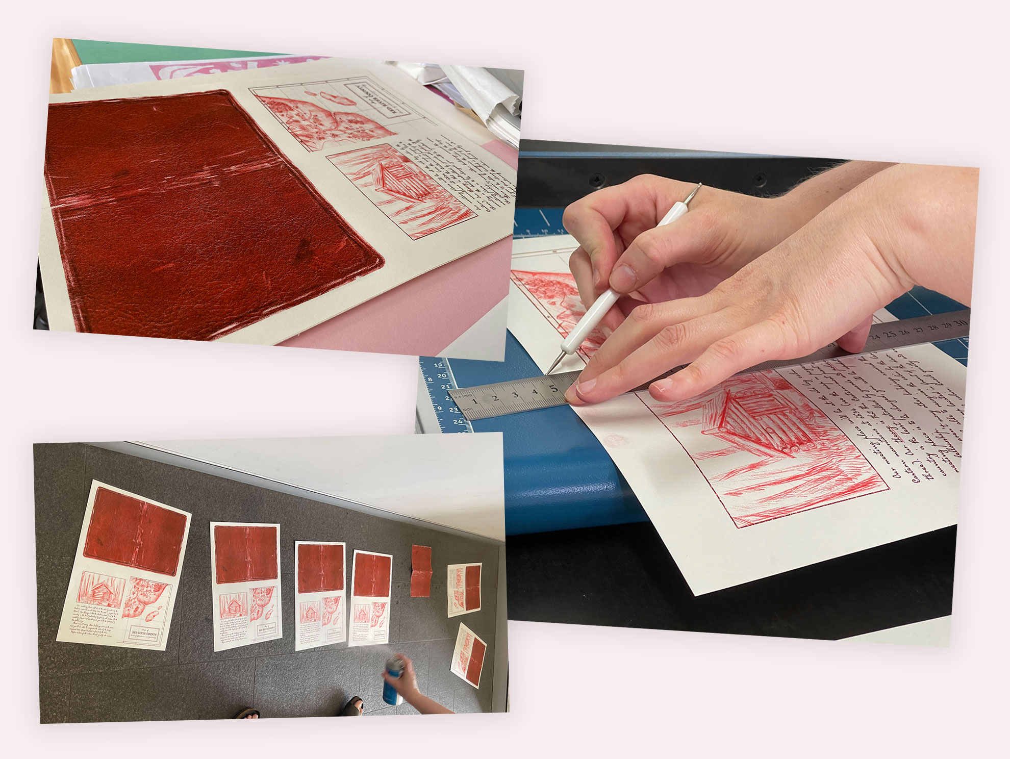
Photos of the print and binding process.
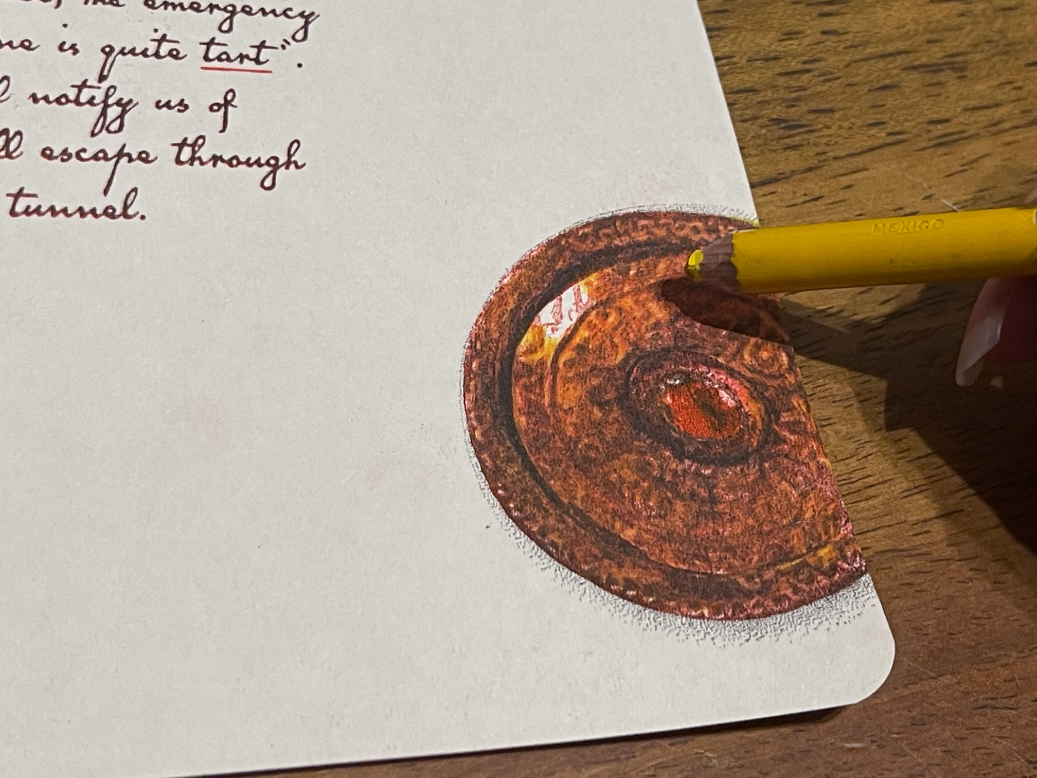
Photo of a printed brooch being hand coloured with a yellow pencil.
Final zine
and reflection
I am very happy about the final results of this zine. The leather image printed out very well and looks very realistic. The texture of the book paper adds to how we would imagine the roughness of the leather to be. Since the paper is in an off-white tone, it further feeds to the vintage look of the notebook style. The illustrations also achieved a much more hand-drawn look in comparison to regular home printers.
For future works, there is opportunity to explore higher page numbers to make the zine feel more substantial.